


With the average consumer being bombarded with between 4,000 and 10,000 advertising messages in a day, it is essential that your branding is impactful.
It’s no secret that customers tend to favour good brands.
But what exactly is a brand and what makes us feel this way?
A brand is often defined as a ‘gut’ instinct or affinity that we develop for something. Whether it’s the first time or the 100th time we’ve seen something, our brains are constantly developing opinions on how we feel about things.
Taking a more scientific approach, this ‘gut’ feeling is actually linked to the subconscious side of our brains, and is shaped day in and day out by everything we’re exposed to!
Whether the conscious side of our brain directly realizes it or not, our subconscious brain is impacted by EVERYTHING we see.
So, how does this affect branding and in this case, your website? It’s simple.
Before a website visitor has time to consciously see or read anything about a company, their subconscious is forming opinions about how it feels.
This feeling plays an important role in the retention of a website visitor.
“Data shows that a website has 7 seconds to engage a visitor, or they’ll bounce!”
Within these 7 seconds, a visitor’s decision to leave or stay on your website is influenced far more by how they feel rather than your actual qualifications. Consider the first impression of your website to be the “trigger” for how one’s subconscious begins to critically analyze the content.
It’s also understood that our brains are biased and will see what it wants to see. If a visitor’s first impression is positive, their brain will be biased towards supporting that opinion as it consciously views the rest of your website. The opposite is true as well for a negative first impression.
Studies are beginning to support that our gut feelings, or ‘intuitions’, can be considered quite reliable. Neuroscientists have published data that supports our ability to make reasonably accurate rational decisions based on intuition alone!
So enough of the science.
Websites need to make good first impressions, branding shapes first impressions, first impressions lead to engaged visitors, and more engaged visitors means more conversions!
You’ve got the hang of it now, so let’s look at how we can use this to our advantage.
Start by asking yourself what emotional factors tie into your brand and the product/service that you’re selling? What feelings do you want your brand to invoke in others that you believe will translate to more sales?
Consider the 8 basic human emotions if you don’t know where to get started: joy, trust, fear, surprise, sadness, disgust, anger and anticipation.
Knowing how you want people to feel is half the battle, the other half is creating a brand that triggers these feelings for your visitors.
Knowing how you want a customer to feel, it’s time to start looking at how this relates to the branding elements that play the biggest role in web design:
Colours
Colour pallets immediately shape how people feel. For example:
Blue = calm & trusting, making it an appropriate colour for insurance and investing
Red = emergency & action, think emergency plumbing or biohazardous cleanup
Green = health & wellness, chosen by many nutritionists and NGO’s
Gold = authority & prestige, making it a common choice for elite home builders
We can take this many layers deeper if we start considering tones and finishes such as flat vs. metallic, light vs dark, so on and so forth!
So, which colours best align with your brand?!
Overall Aesthetic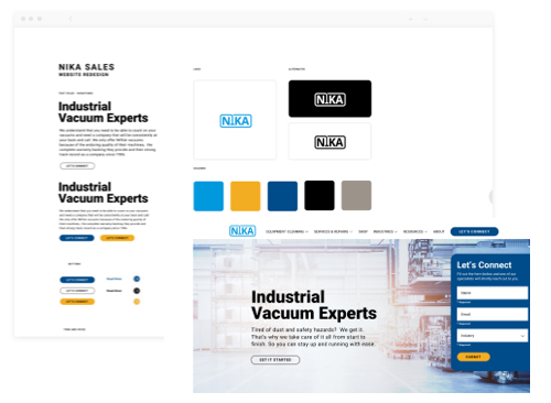
There’s no one “perfect” layout or aesthetic for a website, but your website isn’t your time to show off everything at once. Your homepage is a gateway to the rest of your site and while it should be conversion optimized, it should not be the primary landing page for all your marketing efforts.
Stay away from a busy or crowded layout, and focus on a clean look and feel. This means no extra design elements like shadows, background images, patterns etc. that aren’t necessary.
With consideration for simplicity, did you know that 5 menu items is the ideal number for your navigation bar? When you give people too many decisions, they simply won’t make any decisions.
The takeaway here is that less is more. If you make things simple, you will make visitors comfortable and more likely to spend time on your website.
Images & Video
Video banners are becoming a popular way of immediately engaging visitors and demonstrating what they can expect from working with you. They’re a great way to engage and retain a visitor, reducing bounce rates, increasing time on page, and thus helping your SEO!
Similarly, it’s just as important to use REAL photos of your product, service, team etc. as customers want you to SHOW not TELL them who you are and if you’ll be a good fit. Personalization and the use of real human faces can turn even an average site into a lead generation machine.
Logo
As one of the first things people see, this is the first spot to make both a conscious and subconscious impression on visitors. You’ll want a clean logo that’s easy to read. Ideally, pick 1 primary colour and one secondary colour and then pair them with supporting shades whites & darks.
Modern businesses tend to keep things simple, clean & flat – which means no shadows, glowing or 3D effects.
While taglines might work on business cards you’ll want to avoid including them in the logos on your website.
Lastly, logos are not just about names, but also provide a perception of what you do via your emblem or “trademark”.
Don’t hesitate about making an update to your logo. Launching a new website is a great time to iteratively update your brand and ensure your branding aligns with the end goal for your business. Did you know that Starbucks has updated their logo half a dozen times to date!?
Type
Thin or heavy weight? Narrow or wide? Smooth or edgy? Line height & spacing? Traditional or modern? Or maybe a combination!?
Typography, or “Type” for short, is something that large brands will spend 100’s of thousands of dollars creating from scratch. Now, that’s largely impractical for most businesses, but you do want to choose something that fits you.
Serif fonts, like Times New Roman = Elegance and Longevity but can look dated.
Sans-Serif fonts, like Arial = More modern and appropriate for technology etc.
Heavy font weights = Good for headlines but make paragraph fonts hard to read
Light font weights = Speed, agility and great for the body of websites
Complimentary Fonts = Make it easier to “skim content” and look trendy
Larger Font Sizes are becoming more popular on mobile & for older demographics
Web Ready Fonts = make for faster load speeds and more consistent experiences
When done right, a good choice in type will allow people to feel what you do before they see what you do.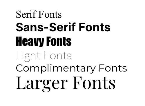
People/Faces
Regardless of what you do, one principle holds true…
“People like to buy from other people.”
That’s why large brands spend millions of dollars annually investing into endorsement deals with athletes, celebrities, or even creating their own fictional characters like “Mr. Clean”. Geiko even went so far as to tie things into cute animals, perhaps one of the only things that people like more than themselves!
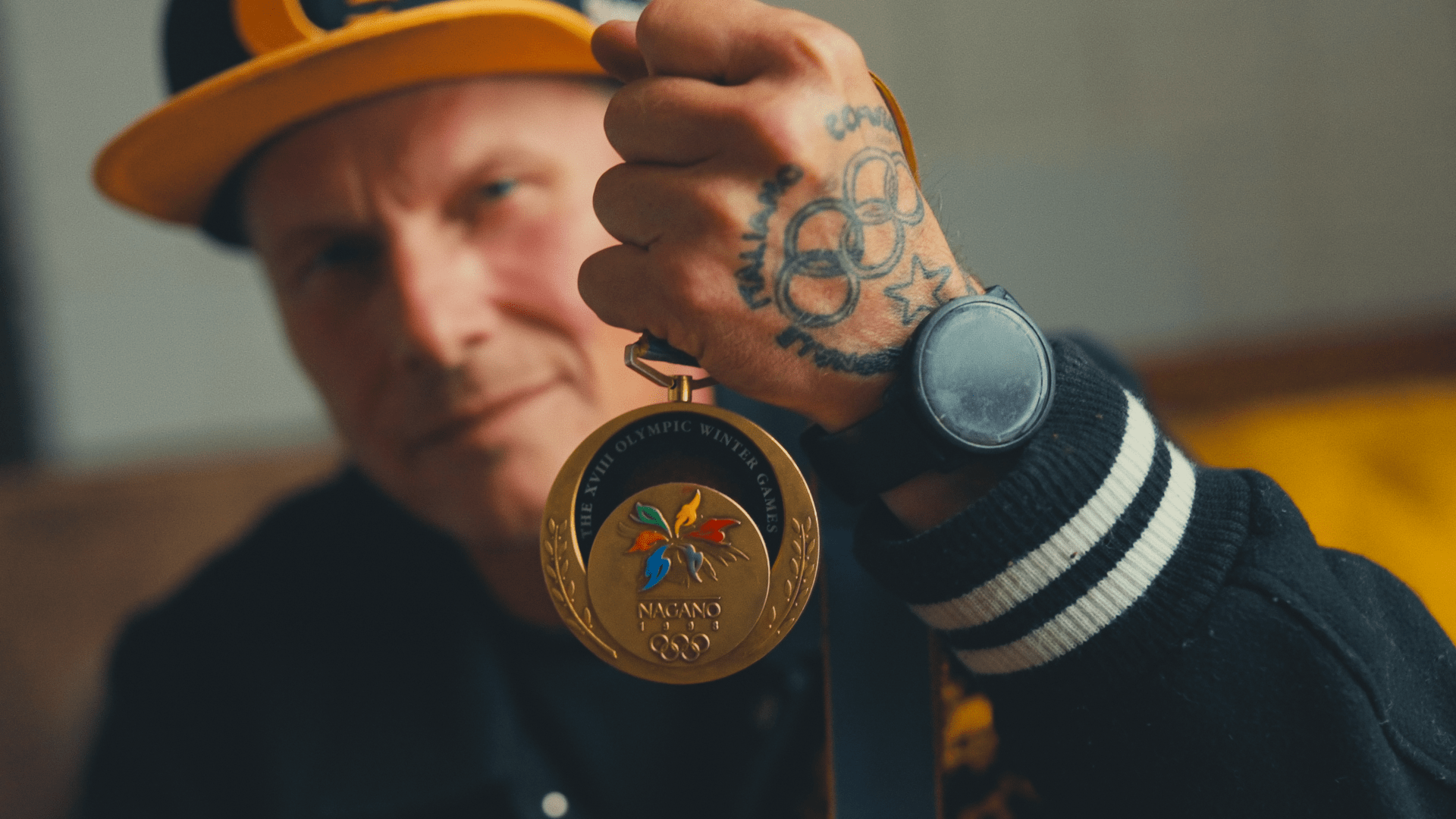
If you have a team, showcase that on your website in photo/video. If you’re the team, then you’re also the brand, so embrace it and use it to your advantage.
In our experience, websites that show “face”, have been proven to convert 2% higher from personalized photography alone!
Helping businesses “discover” their brand is one of the most important (and often most challenging) parts of any website project. With the power of a brand being so strong, it’s easy to see how this step of a website project can often be the most time consuming and also the most expensive.
PRO TIP: Consider developing a mood board or a style scape in order to define the ideal “look and feel” for your brand before you put pen to paper on the website!