


We’ve all been on sites where the branding and style are immediate to us what the website was all about. Perhaps it was geared towards shopping, a small business, software, blogging, social media, etc.
Standard Conventions
While we’ve talked a lot about making your brand stand out, it is also important that you follow standard conventions. Being overly “inventive” with how you design the site can lead to a learning curve that customers just won’t make time for. Overcomplicating how your menu works, how your site scrolls & content is revealed and excessive “effects” can lead to a feeling of being overwhelmed. This is so important that major brands like Amazon err heavily on the side of looking dated with their design in order to keep things familiar for visitors.
Navigation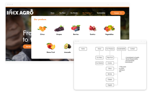
Generally speaking, it is beneficial to provide a navigation experience that allows a visitor to get to any ‘key page’ of interest on your site in just a single click.
Without exceeding 5 main menu items, this requires careful planning of a website’s “information architecture” and drop down menus. It is also becoming more common to use visual aids in menus to help provide a visual “teaser” as to what the landing page has to offer, increasing click-through-rates.
Cross-device Optimization
It’s important to be more than just ‘responsive’ these days. Mobile vs. desktop users will crave a different experience even when buying the same service or product.
Take for example, someone considering a home renovation. They are much more likely to have arrived at your site from social media, and thus will be looking for a journey that builds on what your social accounts have to offer. They are less likely to engage with planning tools that are better suited to desktop visitors, but highly likely to continue exploring your portfolio.
Interface
While load-in effects have become a thing of the past, it can still be a nice touch to compliment your website’s design with tasteful interface elements.
Interface considerations may include some of the following items:
- How your menu and dropdowns appear when interacted with
- How do buttons change when hovered
- Will you be using accordions
Site Speed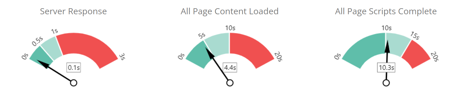
Fairly self explanatory but still essential for visitor retention and a top SEO ranking factor, site speed must be respected especially for mobile experiences. If you’re struggling with site speed, you can take advantage of one of the many auto-optimization plugins that exist, that help optimize images, defer off-screen content, and make recommendations for site file structure. Using web friendly images and embedding videos from third party hosts like Vimeo or YouTube will also help with speeds, especially during peak hours.
PRO TIP: Consider a free trial of a website heatmap tool like Crazy Egg, or Hotjar if you’re looking to see how your website experience stacks up. While these tools can be resource intensive and may temporarily slow down your site, they can provide great insights for page optimization based on real-life customer data.