Web design is fascinating, it goes beyond aesthetics and appeal to combine design concepts, accessibility, functionality and responsiveness between humans and interfaces. In other words, web design is as much user-focused as it is creative.
In an effort to master their craft, web designers look everywhere for inspiration. Naturally, when web design trends evolve year by year, it’s easy to lose track of what matters most, which is to create a meaningful and useful design for the user.
But what does it mean to create a meaningful design? It all starts with user interface design and its key principles.
General design principles include the application of laws, guidelines, biases and design considerations. The principles of user interface design, however, are much more specific as they focus on one constant interaction between a user and an interface.
First, let’s make sure that you understand what lies at the core of user interface design. Then we’ll get into the 10 must-have principles of user interface design.
What is user interface design?
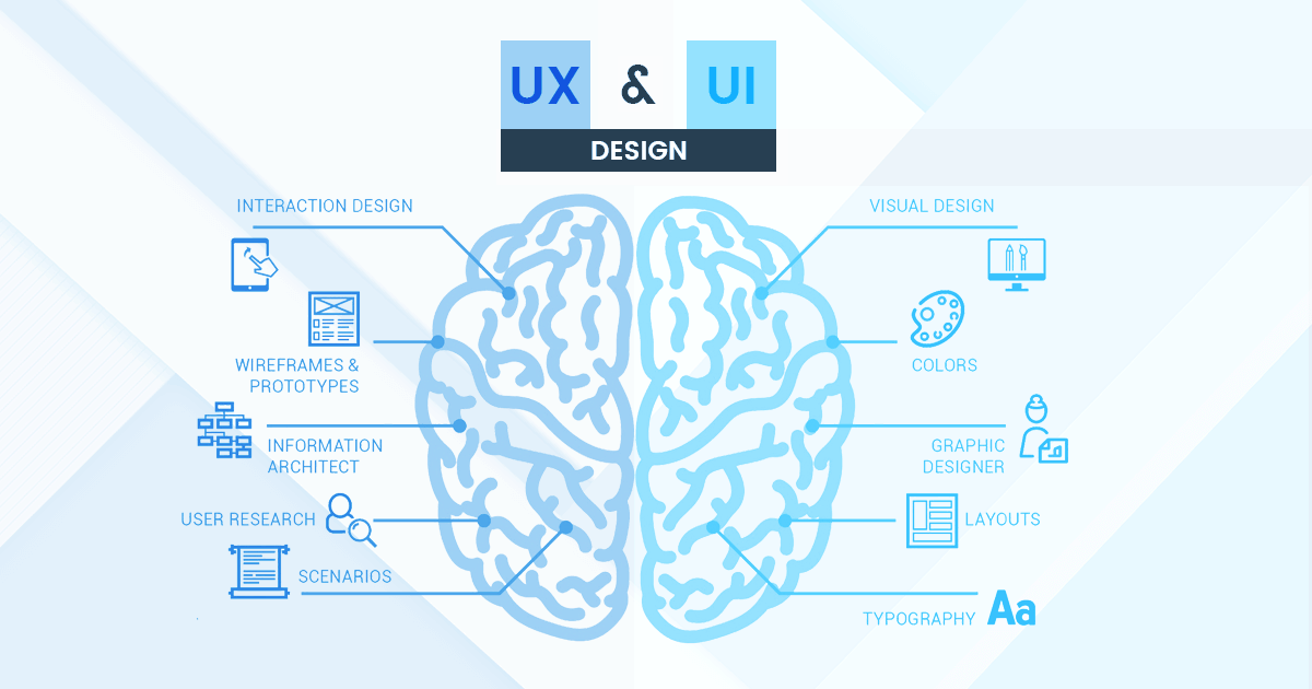
User interface design (UI) is the foundation of a website’s look and feel, it ties together concepts from interaction design, information architecture and visual design.
Essentially, the name says it all: user interface design is all about designing a consistent, clear and simple interface for the user.
While a good user interface establishes the base of a positive user experience, it focuses on user interaction with the interface. User experience design (UX), on the other hand, focuses on the overall experience of users.
List of 10 Must-Have Principles for Good User Interface Design
1. Clarity
2. Consistency
3. Accessibility
4. Feedback
5. Familiarity
6. Design Standards
7. Structure & Hierarchy
8. Simplicity
9. Control
10. Empathy
1. Clarity
For a user interface to truly be effective, the first rule is that it must be clear.
When a user visits a new website, it should be made clear to them what the website is about and most importantly, why they should use it.
A great way to keep a clear interface is by setting a clear journey between your users and interfaces. During each step of the process, it’s important the user only sees actions that are absolutely necessary.
When your interface is cluttered or obscure, there is no clarity. Without clarity, there is frustration.
Here’s a fantastic example of a clear user interface from Rally Interactive, featuring their work with PayPal.

2. Consistency
The second and equally important principle is consistency.
That’s not to say that a website should be exactly the same page by page, but elements with the same purpose should look the same.
Product pages, service pages, contact forms, and informational sections, should all feature a similar appeal and look exactly how they behave.
An example of this would be to have the same contact form on all of your website’s service pages – or even all pages for that matter.
Or, even just headlines and buttons, maintain consistency from element to element and page to page for a well-rounded interface.
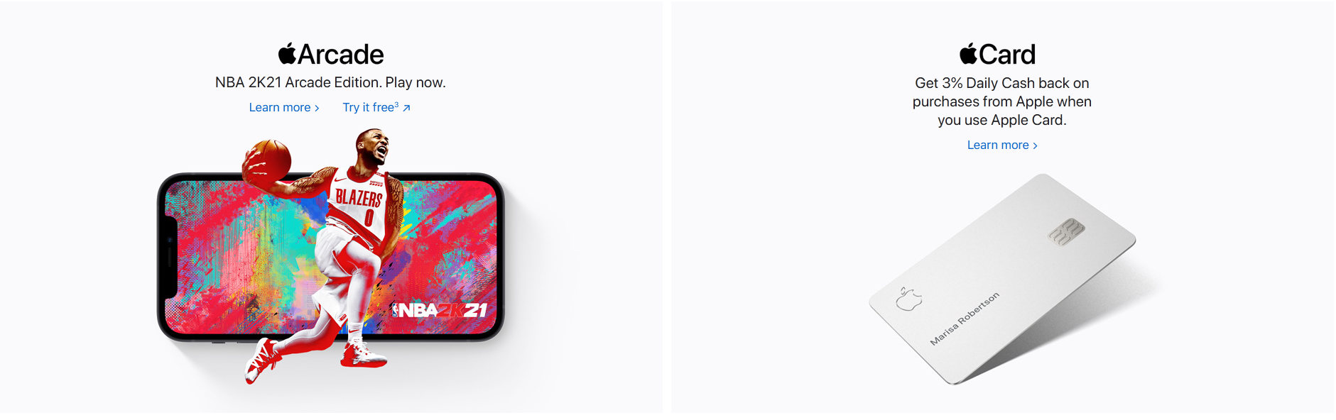
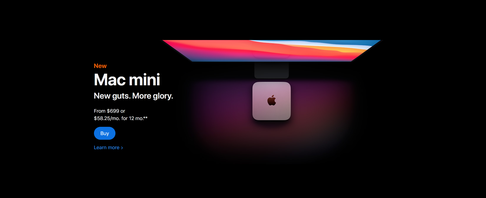
Look at how Apple’s website is consistent with their “Learn more” button styling on all pages of their site. Even when they decide to switch it up with darker backgrounds, they maintain consistency with their element styles and contrast.
It is also important that interfaces are consistent with our expectations. When someone or something constantly behaves the way we hoped it would, we feel that we have a good relationship with it.
3. Accessibility
At the heart of a website’s interface usability is accessibility. To briefly summarize, accessibility is the practice of making a product usable to as many users as possible.
This includes those with low vision, colour blindness, hearing impairments and situational disabilities.
In user interface design, accessibility refers specifically to improving your interface to enhance the usability and ease of use for all users.
Quick tip: Start with an open mind.
Think of all possible users that your interface will serve and then create a product that can provide for all of them.
The font colour, font size, font weight, text length, and line spacing – just because they might look good in your eyes, doesn’t mean they’ll look good from your audience’s perspective.

Our responsibility as designers is to shape our designs for humans, not other designers.
As DesignLab explains it, “beauty is only one aspect of good design, and in most cases, the usability and accessibility of a product are more important than how it looks”.
4. Feedback
The association of feedback with actions on an interface is something we often take for granted.
To name a few, this would include button hovers, error pop-ups, confirmation messages, completion animations, check marks and colour changes.
These days, users have become so familiar with receiving feedback from interfaces that they have come to expect it. I sure do, and odds are you expect feedback as well.
Let’s say you visit a website and you’re interested in their services. You fill in their contact form with your info, spend the time to type your message and click “Send Inquiry”. But when you click and there have been no visible changes since you’ve clicked. No button hover effect, the text remains in the contact form and you got no confirmation message.

Would you assume the message had gone through? Would you give up and leave their site?
According to Zendesk, roughly 50% of customers say they would switch to a new brand after just one bad experience.
5. Familiarity
I’m sure you’ve noticed, but the majority of interfaces will resemble one another to a certain extent, especially web interfaces.
When users visit a website and are searching for a specific section of your website, they expect to find it within just a few clicks.
Whether it be a contact form, navigation menu, gestures or even the use of favicons for social media links, we all look for familiarity. As humans, we are creatures of habit. When we find key areas where we expect them, we feel comfort and reassurance.
Familiarity can also play a major factor in specific industries. Where we expect all websites to look and act mostly the same.

Like how we expect all websites to have their logo in the top left which leads to their home page. This wasn’t always a standard, but now we expect it on every website visit.
Familiar is good, understand how it applies to your project(s) and use it to your advantage.
6. Design Standards
Throughout the process of creating an intuitive and useful interface for your user, it’s crucial that you set, understand and follow design standards.
Design standards are key to creating valuable products in all facets of design. Whether it be user interface design, graphic design, product design or software design, stay up to date with design standards and follow set guidelines.
When we follow guidelines, we achieve an exceptional end result which meets the needs of a broader audience.
In user interface design, these standards include the proper use of colour, contrast, balance, layout, alignment, hierarchy, the placement of elements and much more.
For more information on design standards in UI design, see this resource by Senior Product Design, Jaxon White.

7. Structure & Hierarchy
By now, you know that UI design is all about creating interfaces that users can interact with.
But before the user can interact with an interface, they’ve got to know the purpose of the interface.
In user interface design, this is achieved with visual hierarchy, the design principle that puts emphasis on the most important visual elements.
Put simply, visual hierarchy helps the user know where to look first.
This can be done in a number of ways, but a great start is with size. More specifically, the size of text and elements.
Size is arguably the most effective way to shift user focus to visual elements. It’s the precise reason why billboards and newspapers have large headlines and smaller supporting text.

8. Simplicity
Designing a simple interface is pivotal to UI design, but it’s often easier said than done.
In user interface design, simplicity is the process of minimizing, refining and making a positive impact with less.
According to usability.gov, a simple interface is almost invisible to the user. It should avoid unnecessary elements and be clear in the language used.
In brief, a simple interface is not only clear or concise but much more pleasing as it rids us of an aspect we all despise: clutter.
Without clutter, users will feel comfortable and effortlessly use your product to the best of their ability.
Here’s an example of an extremely simple interface: exploding topics.

9. Control
Good user interface design isn’t just simple or familiar, it instills a deep sense of control in its users.
When the user feels in control of the application, they feel more comfortable and are much more likely to stay for extended periods.
But what does it mean to make the user “feel in control”?
To create an interface that instills control in its users is to create one that’s forgiving. This means that applications should always allow users to reverse actions at all stages of the interface.
However, it also means creating an interface that’s easy to use, and easy to navigate. Users shouldn’t have to scramble or dig through pages to find what they’re looking for.
User control goes hand in hand with feedback, when the application gives them the feedback they’d predicted, they will feel more in control.
10. Empathy
One of the greatest difficulties of user interface design is to truly understand users and empathize with them.
As designers and developers, we often think that we understand our users’ intent, goals and motivations, but usually, we don’t. And in the rare case that we do, we often forget about empathy.
The role of empathy in design is to observe, identify, analyze and resolve any previously unidentified behaviours, methods, and problems.
As the Nielsen Norman Group explains it, empathy mapping is the first step in design thinking as it is our job to advocate on behalf of the user.
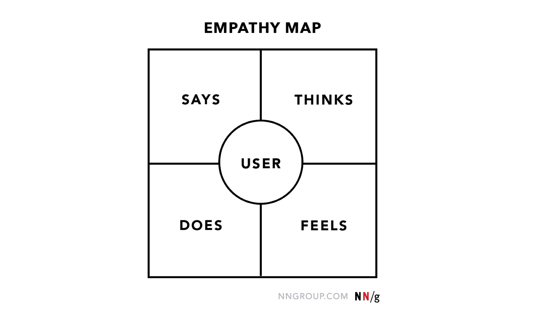
With empathetic design, we can remove bias, uncover weaknesses and design interfaces which users will truly appreciate.
Looking for help with your website’s user interface?
Let’s work together to make your website engaging, user-focused and extremely successful.