Dark mode or light mode? As consumers, the choice is frequently up to us on social media, software and other user interfaces.
But what about website design? If you’re looking to design or redesign your website, you might be somewhere in the middle – wondering which theme is best for your business.
At WebMarketers, we’ve developed and launched over 250+ websites with all sorts of colour schemes, here’s what we found out about dark and light themes.
Table of Contents – Dark VS Light Website Themes
1. Understanding The Differences
2. Dark Website Theme Examples
3. Light Website Theme Examples
4. What’s Best For Your Website?
Understanding The Differences
On the surface, choosing a website’s colour scheme appears to be quite simple. That’s likely a result of the common misconception that a website’s colours are based on branding alone and have little impact on a website’s success.
But there’s much more to it than that. Colour alone can have a negative impact on a website. It can even affect the user’s ability to read website content and interact with the interface. That’s why we recommend you pay close attention to truly understand the differences and effects of dark and light website themes.
Readability
Colour and contrast are two crucial elements to consider when optimizing a website, both for obtaining the ideal appearance and optimal readability.
Whether you choose a light theme or opt for the dark side, it’s necessary that you work to provide users with optimal text size and visible contrast. As Material.io explains it, dark themes use dark grey rather than black and a desaturated secondary colour to meet the 4.5:1 contrast requirement.
The main difference here is that light themes can easily get away with full saturation for several elements whereas dark themes should be limited to one or two branded elements.
Conversion Rate
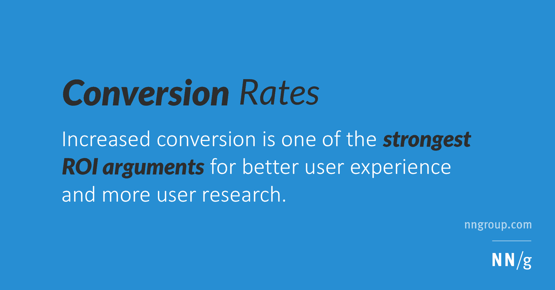
According to a study on the Psychology of Colour, between 62% and 90% of a user’s subconscious judgement of a website is based on colour.
Here’s what we know for certain, a user’s website theme preference varies by the target audience. So not all websites should use a light theme, but they shouldn’t rush to use a dark theme either.
I know, there’s a lot more to a website’s conversion rate than its colours, but let me explain. Choosing the best theme for a website is a question of understanding your target audience’s perception of colour and applying this knowledge to benefit you.
For example, wouldn’t it be strange if you visit a law firm’s website to request legal advice and their main colour scheme is black and purple? We’ve come to expect legal websites to be neutral, practical and authoritative, not energetic, motivational or creative.
The takeaway here is that no colour will guarantee a perfect conversion rate, but choosing the right one can help convey the right emotions and bump it in the right direction.
5 Dark Website Theme Examples

1. Red Rooster Golf
Colour psychology suggests that dark themes demonstrate formality and sophistication. This works perfectly for Red Rooster Golf, a premium golf glove startup.
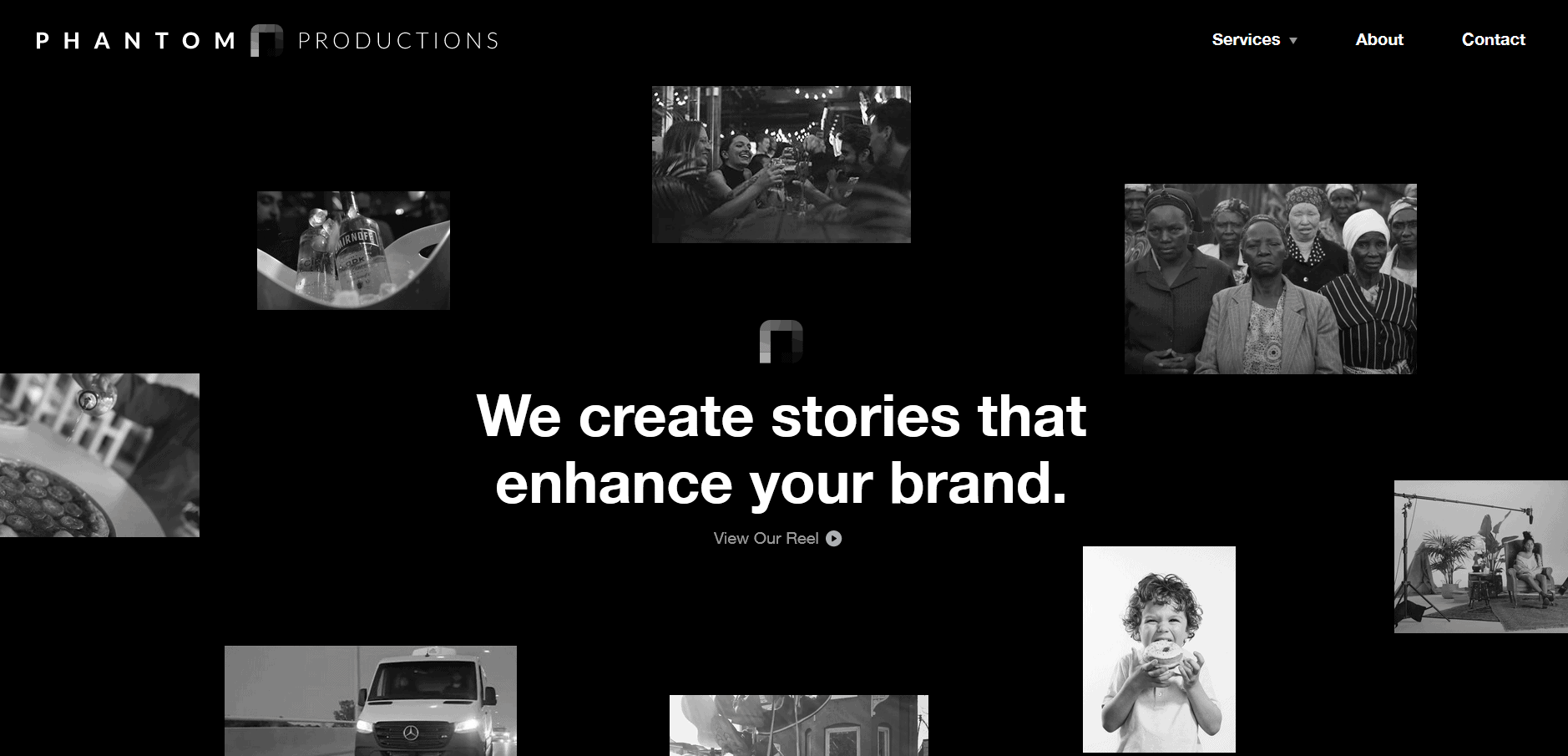
2. Phantom Productions
Are you an industry leader? Consider this approach to website design. Phantom Productions maintains a high level of authority with a sleek dark look and visual hierarchy.

3. Claridge Homes
Claridge Homes is an Ottawa home builder that takes pride in designing dream homes. With their new dark theme website design, users can get a better feel of the true quality they provide.

4. Premium Meats
Dark themes and backgrounds have proven to work exceptionally well in ecommerce and luxury products. For Premium Meats, this can result in increased overall sales, including more expensive meats like their Wagyu Box.
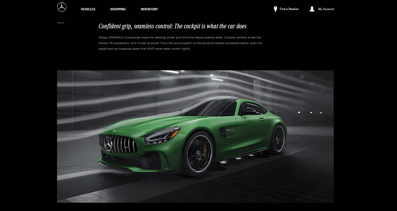
5. Mercedes-AMG
Here’s one you might be familiar with, high-performance luxury automaker Mercedes-AMG. With this dark theme approach, Mercedes better promotes AMG as an exclusive and luxurious brand.
5 Light Website Theme Examples

1. Bear Walker Boards
Light website themes are simple and can be quite refreshing, here’s a great example. Using thoughtful whitespace, Bear Walker shifts focus to the creative elements of their custom boards.
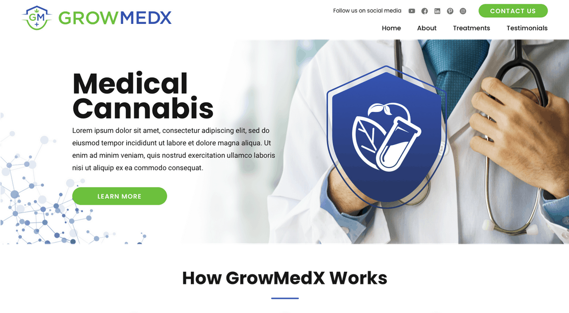
2. GrowMedX
Ottawa’s GrowMedX light theme website leads the way with a professional appeal and incredible simplicity.
3. EB3
Looking for a design that’s just a tad more creative for your website? EB3’s website design takes a new approach to light website design with simple and bright visuals without sacrifice.
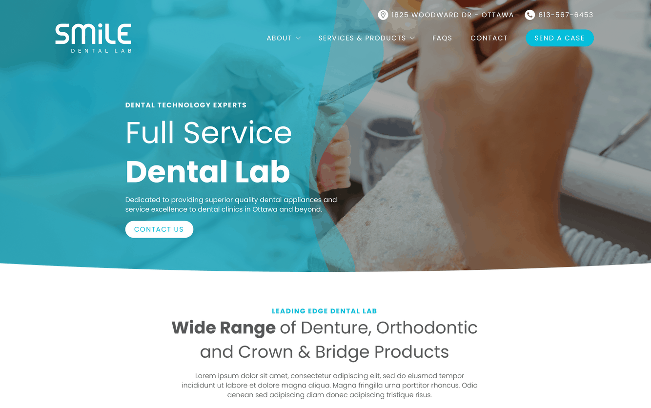
4. Smile Dental Lab
For Smile Dental Lab, a light website theme is used as the bridge between their professionalism and dental services. This design is another fantastic example of using whitespace to elevate the brand.

5. Talavera Tiles & Surfacing
Talavera Tiles is one that you might’ve seen before in our previous blogs. I use this example often as it far exceeds all expectations with creative elements, contrast and professionalism.
What’s Best For Your Website Design?
As usual, there are no one-size-fits-all solutions to choosing the perfect theme for your website, so we’ll have to keep it quite general.
Here’s what we think, light themes are generally better for dental, professional, home services, health, e-commerce and legal websites.
On the other hand, we have dark themes. Dark themes are commonly found on construction and contractor websites, applications, and real estate websites but they can also do quite well on legal websites and e-commerce stores.
Wondering what type of theme is best for your business? Reach out to get your very own free digital analysis to get website recommendations from the experts.