


Not getting enough website conversions? Struggling to turn a profit with your website? The issue could very well be in your contact forms.
According to Neil Patel, optimizing your contact forms can increase your conversion rate by as much as 672%.
But they seem so simple, right? Just a few text fields for users to fill if they want to reach out.
In reality, they are much more than just a form of contact. Contact forms are a crucial point of conversion and should be carefully crafted for each page.
Even the slightest error can decrease your conversion rate by 50% or more, so you’ve got to be extremely cautious.
Not sure where to start? Here’s our list of the 8 contact form best practices to increase your conversion rate.
Table of Contents – Contact Form Best Practices
1. Choosing the Perfect Form Layout
2. Reducing the Amount of Form Fields
3. Positioning your Contact Form(s)
4. Writing the Perfect Call to Action
5. Avoiding Common Contact Form Mistakes
6. Increasing User Trust with Testimonials
7. Testing your Contact Forms
8. Contact Form Tracking
Our List of 8 Contact Form Best Practices
1. Choosing the Perfect Form Layout
Contact forms come in all shapes, sizes, colours and various possible layouts.
According to a study on the usability of web forms, the use of a familiar form layout plays a major role in establishing a sense of comfort within the audience.
When you scroll through social media or search for a local business on Google, you’ll see plenty of contact forms. Like all things, as we expose ourselves to more and more contact forms, we become familiar with certain layouts. Over time, we come to expect these familiar form layouts with each website we visit.
That being said, we get the best results when we stick to the following two formats: horizontal banner and the traditional rectangle.

Even as layouts change, some aspects remain similar, such as smaller input fields for name and email, the larger input fields for message/questions and a clear call to action with larger text which stands out from the other elements.
Even the slightest deviation from the standard layout can have a negative impact on your conversion rate – so be extremely careful here.
2. Reducing the Amount of Form Fields
Not all contact forms are created equal. I’ve seen some amazing contact forms and I’ve seen some terrible ones too (and they continue to haunt me).
Think of the last time you came across a large contact form with more than 10 steps… It’s extremely discouraging and you don’t want to fill it unless you absolutely have to.
Our Recommendation
Your contact forms should only ask for the information that is absolutely necessary.
If you own a landscaping business, for example, your website’s contact forms should only require the user’s name, email, phone number and their message. For many businesses, the phone number or message field may not be necessary at all. Don’t include it in your contact form unless you need it.
This is especially the case for the phone number field. Research shows that asking for a user’s phone number almost always leads to increased form abandonment.
3. Positioning your Contact Form(s)
Placement and positioning are crucial to achieving an optimal contact form conversion rate.
According to Microsoft Research, your website has 10 seconds to communicate your value proposition in order to benefit from the negative aging effect of a web page.
Let me explain… The study shows that the longer a user stays on a website, the likelihood of leaving decreases at that given moment. As Nielsen Norman Group explains it, the negative aging effect is a scenario where users will leave quickly (10-20 seconds) if the page has no value to them.
But if they are given a value proposition within these first 10-20 seconds, they are more likely to stay for several minutes. For the majority of small businesses, this “value proposition” is your contact form or main call to action.
The rest is pretty straightforward, place your contact form in an obvious and visible area of your page and more users will interact with it.
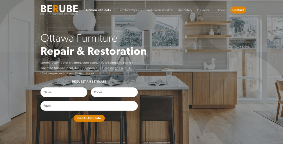
The best place for your contact form & call-to-action
Your call to action (CTA) should always be at the top of your landing page (above the fold). Being that you have 10-20 seconds to make your value proposition, placement near the top is crucial to capturing user attention.
Even if your contact form is not your main call to action, it needs to be visible on every page.
The best way to do this is by adding a “contact” or “contact us” element in your navigation menu and linking it to a separate contact page or to a contact form in the page footer.
See the image below for a great example of a perfect call to action & contact form implementation.
4. Writing the Perfect Call to Action
Remember that newsletter you signed up for 4 months ago that fills your inbox 3-5 times per week? We all have or have had them, and they’re the exact result of an amazing call to action.
Think about it, you were first drawn in by the design and proposition, then hooked in by the call to action. That’s what you should want from your contact form, at this point it’s all about your call to action.
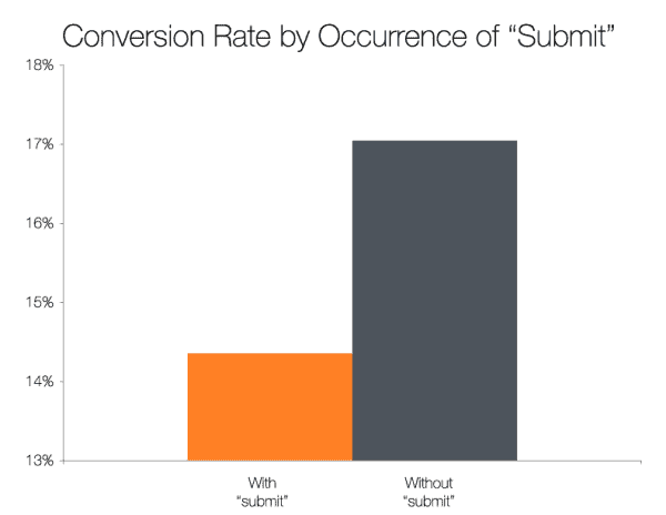
According to Hubspot Research, the most clicked buttons are those which didn’t use “submit” as their call to action. Instead, create a call to action that more appropriately describes what the user obtains from clicking. Some great examples of this would be “get an estimate”, “order now”, “book your appointment” and “request a quote”.
It doesn’t have to be difficult, take some time to understand what the leaders of your industry are using for their call to action and test a few options to see what works best for you.

5. Avoiding Common Contact Form Mistakes
Creating a great contact form is as much about avoiding common mistakes as it is following best practices.
Over the years, we’ve had hundreds of clients and have created an overwhelming amount of contact forms. As we became more familiar with them, we recognized a number of common conversion-killing mistakes.
Avoid having too many required fields
Required fields are the ultimate buzzkill in contact forms – nobody likes them.
If your contact form has a lot of fields, consider removing those that are unnecessary. Or at the very least, make them optional.
Marking a form field as “optional” is an easy way to lighten the user’s cognitive load and simplifies their interaction with the contact form.
Don’t forget about your mobile users
In 2021, mobile devices make up more than 50% of all website traffic.
For some industries, this number can spike up to as much as 68%, so don’t forget to make your forms responsive. Tons of people use their phones as the main way to browse the internet.
Creating a responsive mobile-friendly form can explode your conversion rates, make it a priority.
Don’t be exclusive with your field formats
Does your form ask for the user’s email or phone number? Ditch the field formats, there’s nothing more discouraging to a user than having to add or remove dashes in their phone numbers.
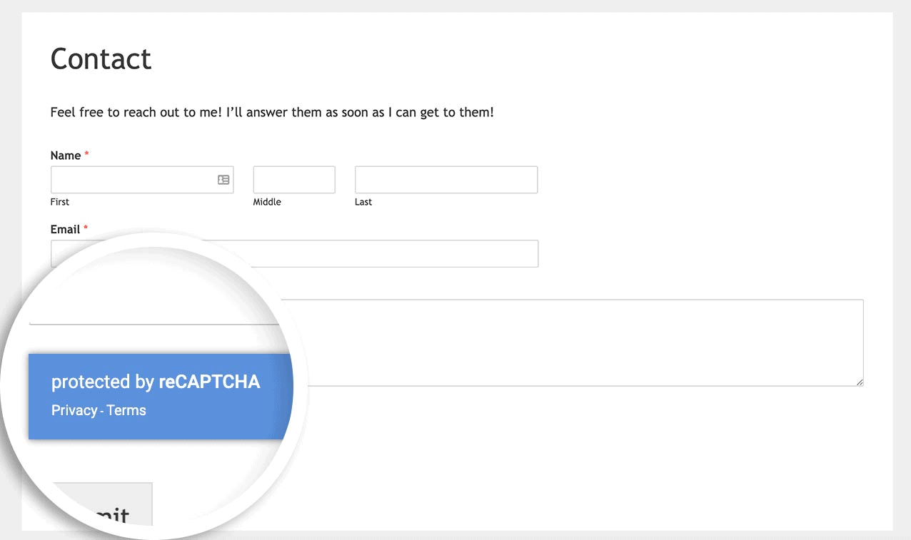
Don’t forget about spam protection, use an invisible recaptcha
Installing a captcha is crucial to filtering out spam and protecting your website from a number of potentially harmful attacks.
But don’t use a traditional captcha, study shows that they can have a negative impact on your conversion rate (about a 3% loss).
Instead, use an invisible recaptcha, they use an advanced risk analysis to prevent spam software and is extremely easy to bypass as a user. Plus, it’s free and made by Google.
6. Increasing User Trust with Testimonials
Obtaining the trust of your users is key to achieving an optimal conversion rate, even for contact forms.
That’s why you’ll see client testimonials, case studies and Google review ratings within a few elements of most main CTA’s.
It’s been proven, users on the fence are more likely to inquire, request or reach out when they’re shown social proof that your product/service has a positive impact on others.
Social proof comes in many forms: logos of known brands you’ve worked with, Google reviews, client testimonials and statistics.
Can’t choose one? There’s nothing wrong with using several forms of social proof, here’s how workplace communication app Slack approaches social proof.

7. Testing your Contact Forms
The easiest method of ensuring your contact forms have a high conversion rate is to put these best practices to the test.
When making changes to your website, it’s crucial that you conduct plenty of tests to achieve a great user experience and the results you wanted.
User Experience Testing
First, there’s user experience testing, the practice of testing your product with real users to uncover issues before the product is published.
The process of testing your contact forms is a great way to find areas of improvement/optimization that you would not have found by yourself. Plenty of businesses claim they’ve improved conversion rates just by fixing their user experience. Want to see the best results? Test your contact form with a wide variety of users.
A/B Testing
Unsure of which form design or call to action you want to use? I have a solution for you: A/B Testing.
A/B Testing is the user experience methodology used to experiment with two variants of a product. It’s key to helping you find the most successful contact form design and call to action as it tests the two variants with real users.
8. Contact Form Tracking
Tracking your contact form is crucial to optimization. When you properly track your forms, you get to see the amount of views, conversions, and conversion rates which your form gets.
With all of these statistics available, you can identify exactly which type of form performs better and gain valuable insight to further optimize your conversion rate.
Installing proper contact form tracking is time consuming but highly rewarding – don’t miss out.
Looking for help with your contact form implementation?
There’s a lot that goes into creating the perfect contact form when you’re looking to get the most of your current website traffic. Let us help you get started!