The Real Reason People Leave Your Website (And What to Do About It)
Let’s face it: getting people to land on your website is no longer the hard part. With the right SEO, ad strategy, or social media campaign, you can drive traffic all day long. But here’s the thing — clicks don’t pay the bills. What really moves the needle? Making people stay, engage, and convert once they land.
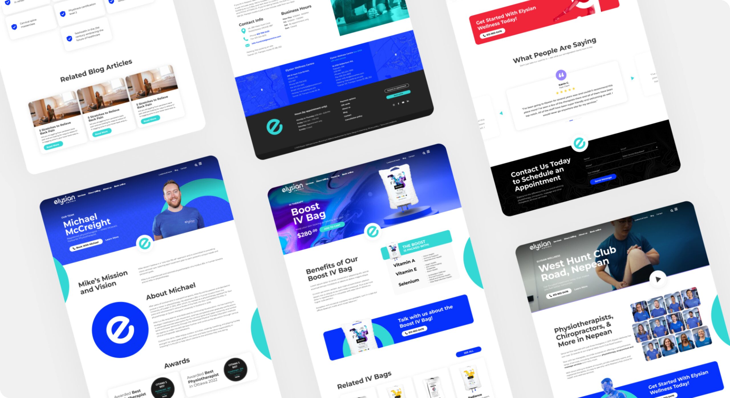
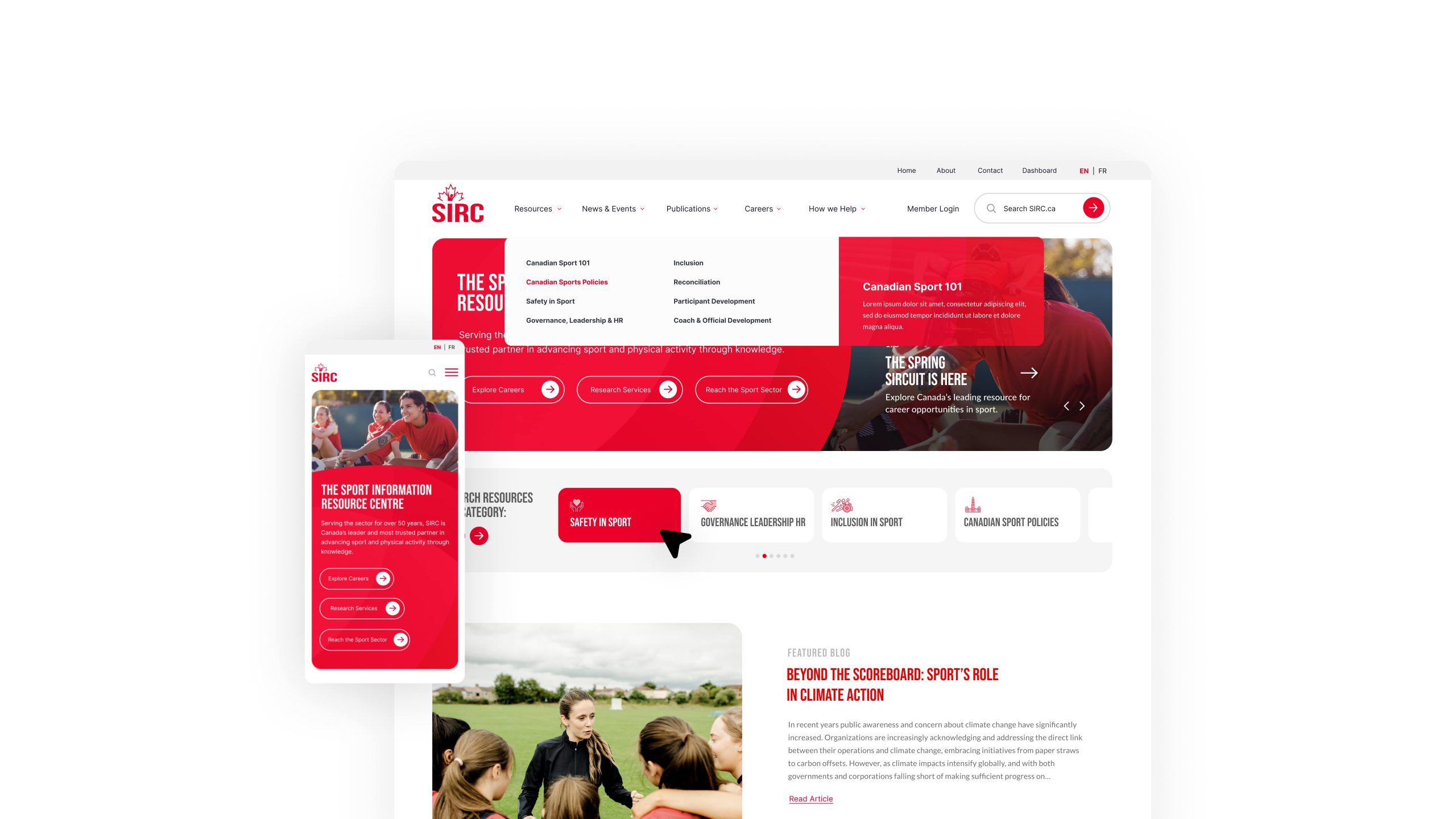
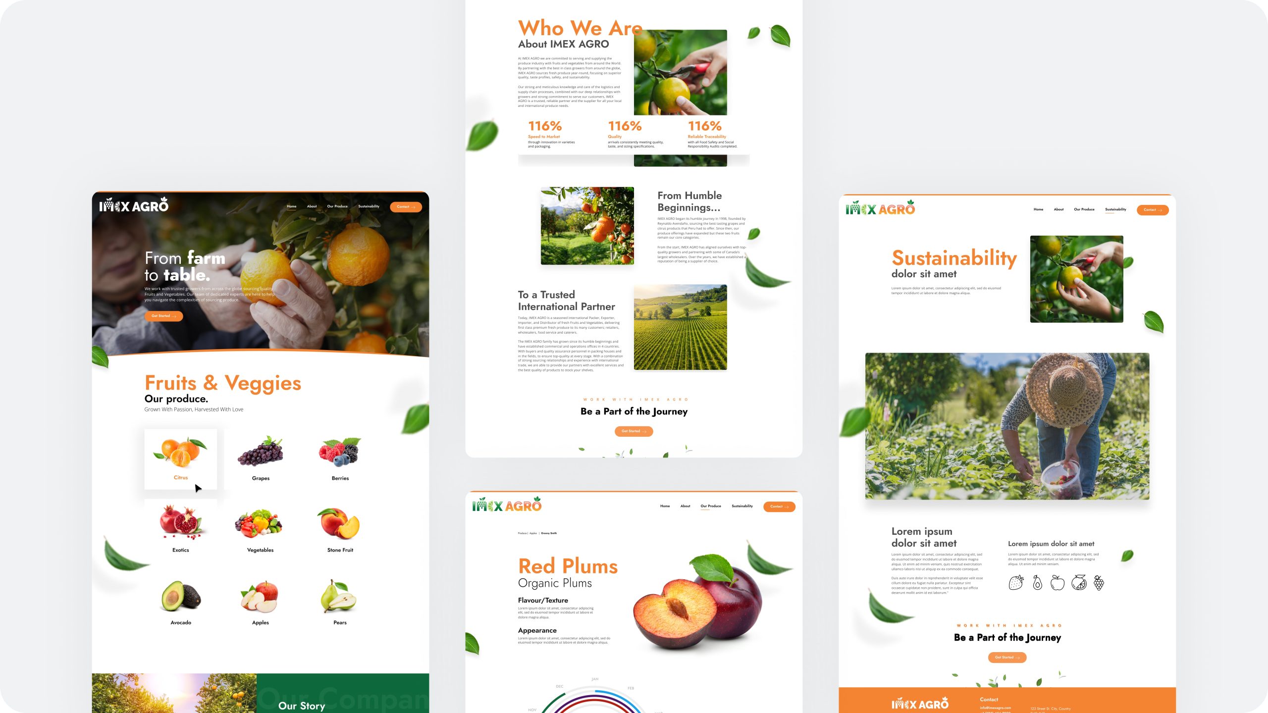
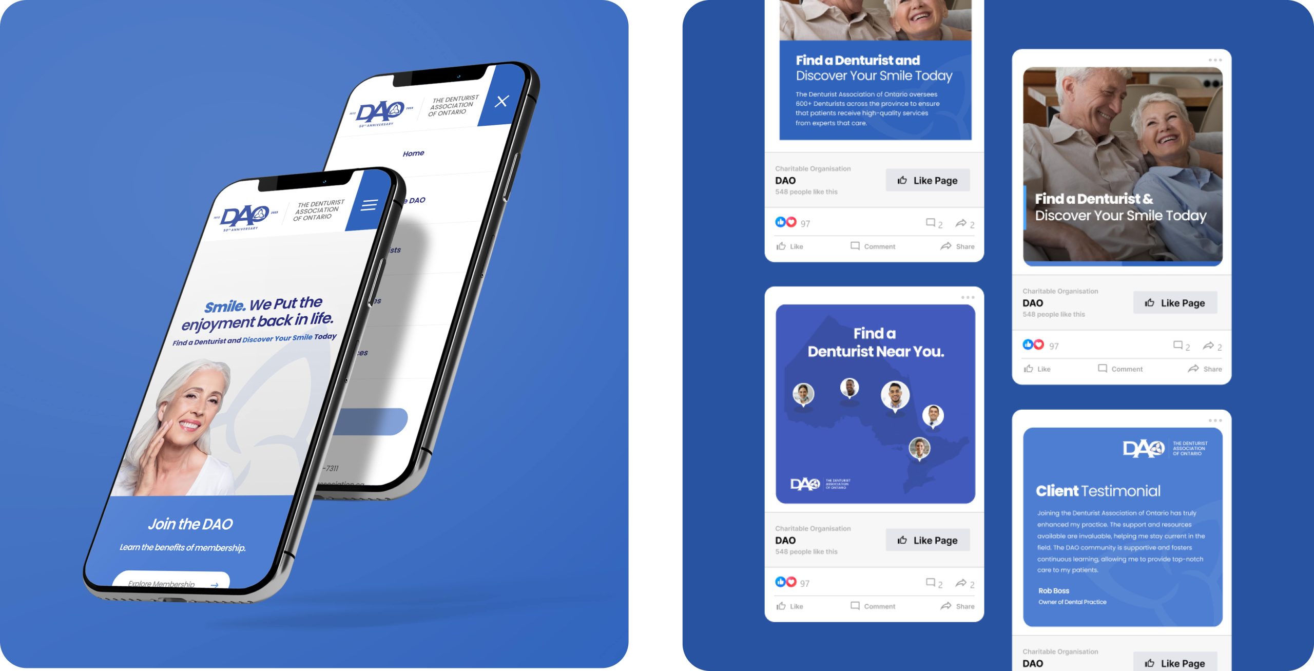
At WebMarketers, we’ve spent the last decade helping entrepreneurs and businesses scale online. And one thing we’ve learned: sticky websites win. If your bounce rate is sky-high and your session duration is in the toilet, you’re leaving money on the table. Here’s how we help brands fix that — and how you can, too.
1. Clear Value Right Off the Bat
Your website has about 5 seconds to answer the question:
“What is this, and why should I care?”
If you don’t deliver fast, you lose them.
Here’s what works:
Strong headlines that speak to a real pain point
Subheadings that reinforce benefits, not just features
Instant credibility — think awards, stats, or a killer testimonial
2. User-First Navigation
If your site is a maze, people won’t explore — they’ll bounce. Every second they spend thinking about how to find something is a second closer to them closing the tab.
Our approach:
Keep the nav clean and predictable — 5–7 top-level links max
CTA buttons that are clear, direct, and don’t try too hard
Use sticky navs or breadcrumbs if your site has depth (hello ecommerce)
Avoid: Dropdowns inside dropdowns. No one has time for that.
3. Content That’s Actually Worth Reading
The internet’s full of fluff. People can spot a lazy paragraph or AI-garbled blog post from a mile away.
What keeps users engaged?
Content that educates, entertains, or solves a real problem
Bullet points, bold headers, and clean formatting
Case studies, product demos, or behind-the-scenes videos
We call this “scroll glue.” The more time they spend with you, the more likely they are to trust (and buy from) you.
4. Trust Signals (Without Looking Desperate)
People are skeptical — and rightfully so. Every week there’s a new “guru” or drop-shipper pushing a half-baked product.
How to earn trust:
Real testimonials (with names + faces)
Client logos, media mentions, or industry awards
Transparent contact info, About page, and clear policies
Bonus points for security badges, HTTPS, and privacy-friendly design. It’s 2025. Nobody wants to feel like they’re being tracked in a dark alley.
5. Smart Interactivity That Doesn’t Scream “Sales Funnel”
Quizzes, calculators, chatbots, product filters — when done right, these tools help users find what they’re looking for faster.
What we recommend:
Tools that solve a problem (think: ROI calculator, size guide)
Personalization without creepiness
Chatbots that actually help vs. just capturing leads
But let’s be clear: if your popup appears within 3 seconds of landing, you’re doing it wrong.
6. Flawless Experience on Mobile (Seriously)
More than 60% of traffic is mobile. Yet we still see sites that break the second you open them on a phone.
Our checklist:
Fast load times (under 3 seconds)
Tap-friendly buttons and legible fonts
No horizontal scrolling, ever
We test every site we launch across real devices — not just simulators. If it doesn’t perform on mobile, it doesn’t go live.
7. A Narrative That Flows
Landing pages are just one piece of the puzzle. Great websites tell a story and guide users through a natural journey.
Our strategy:
Structure content like a funnel: Awareness → Interest → Action
Anticipate objections and answer them before users even ask
Use CTAs that feel helpful — not pushy
Whether you’re a SaaS startup or a trades business, the goal’s the same: keep them scrolling, clicking, and connecting.
Final Word: Build for People, Not Just Algorithms
It’s easy to get caught up chasing SEO, trying every UX trend, or dumping money into ads. But the secret to a high-performing website isn’t rocket science — it’s empathy. When users feel understood, respected, and guided — they stay.
And when they stay, they buy. They refer. They come back.